
Want to make a brochure that grabs attention? Great! Whether it’s for a business, an event, or a new product, a brochure can get your message across fast. But only if it’s done right.
Don’t worry. Designing a brochure doesn’t have to be hard. Let’s break it down into simple steps. And yes, let’s make it fun too!
1. Keep It Clear
First things first – what’s the brochure for? Is it to sell? Inform? Invite?
Pick one main goal and stick with it.
If you try to do too much, it gets cluttered. Keep your message clear and focused. That way your audience knows exactly what to do.
- Want them to buy something? Tell them why they should.
- Got an event? Show what’s exciting.
- Sharing info? Make it simple and helpful.
2. Know Your Audience
Are you talking to teens? Seniors? New moms? Business people?
Your audience decides your style, colors, and words.
Example: A brochure for a kids’ camp should have bright colors and playful fonts. A brochure for a law firm? Think clean, professional, maybe dark blue and gray.
3. Nail the Headline
People decide in seconds if they’ll keep reading. So give them a reason to!
Your headline should be short, bold, and to-the-point. Ask a question. Share a benefit. Make them curious.
Examples:
- “Ready to Boost Your Business?”
- “This Weekend Only! Don’t Miss Out!”
- “Healthy Habits Can Be Fun – Here’s How”
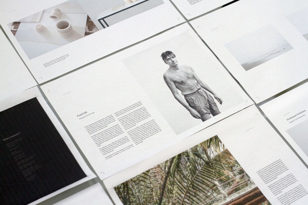
4. Choose the Right Layout
Brochures come in all shapes—bifold, trifold, Z-fold.
Pick the one that fits your info best.
- Trifold: 6 panels. Great for step-by-step info.
- Bifold: Fewer folds, more space per panel. Great for visuals.
Use one side for images and highlights, the other side for the details.
5. Use Eye-Catching Design
A beautiful brochure can say more than words ever could.
Here are some design tips:
- Use colors that match your brand.
- Pick 1–2 fonts max. Too many fonts can look messy.
- Leave space to breathe. Don’t cram everything in.
Want to really shine? Use high-quality images and icons. Make sure your logo is easy to spot too.
6. Make It Easy to Read
Keep your sentences short. Use bullet points.
Avoid big blocks of text. They scare people. No really, they do.
Don’t forget headers and subheaders. They guide the reader and make scanning easy.
7. Add the Important Details
Include:
- Your contact info – phone, email, website
- Your location – if they need to visit you
- Call-to-action (CTA) – what do you want them to do?
Example CTAs: “Call us today!”, “Visit our site”, “Book your spot now!”
8. Give It a Test Run
Before you print 1,000 copies, show your draft to a few people.
Ask them:
- Is the brochure easy to understand?
- Do they know what action to take?
- Does anything feel confusing or out of place?
That last-minute feedback can save you time and money.
9. Print It Right
A great design deserves great paper.
Don’t go for the cheapest option. Glossy or matte? Thick or thin? Pick what feels right for your brand.
And always ask for a proof before printing the full batch!
Wrap-Up
And that’s it! Now you know how to design a brochure that works.
Just remember:
- Be clear.
- Know who you’re talking to.
- Keep it simple and smart.
With good design and the right message, your brochure will stand out – and get results.
Now go on, create your masterpiece!