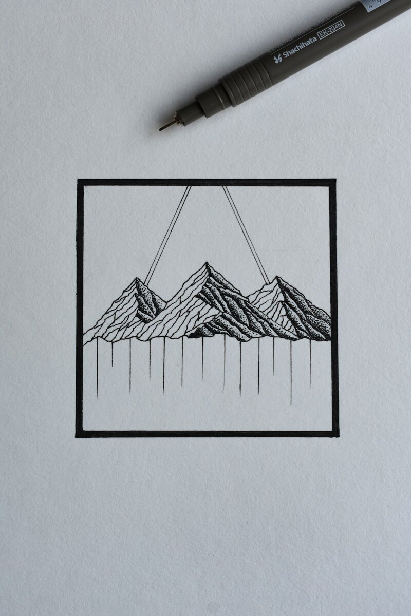
In today’s crowded marketplace, where brands are constantly competing for attention, simplicity can be the most effective approach to visual identity. Minimal logo design focuses on distilling a brand’s essence into its most fundamental form. Rather than relying on flashy elements or complex graphics, minimal logos use clean lines, basic shapes, and strategic typography to convey meaning. Properly executed, a minimal logo can be timeless, highly recognizable, and deeply memorable.
The Philosophy Behind Minimal Logo Design
At its core, minimalism is about reduction and clarity. It’s a philosophy that extends beyond graphic design into architecture, product design, and even lifestyle choices. In the context of logo design, minimalism is about stripping away anything unnecessary until only the most essential elements remain. This not only enhances the visual appeal but also aids in brand recognition.
Minimal logo designs are especially effective in the digital age, where logos need to be clear and legible on various screen sizes. Whether appearing as a favicon on a browser or emblazoned across a billboard, these logos maintain their effectiveness due to their simplicity.
Key Characteristics of a Minimal Logo
A great minimal logo is not just simple—it is intentional. Every element must have a purpose. Some defining characteristics of minimal logos include:
- Geometric shapes: Circles, squares, triangles, and other basic forms are often the foundation.
- Limited color palette: Typically one or two colors are used to keep the focus on form and contour.
- Negative space: Clever use of background space to form shapes or add dual meanings.
- Sans-serif typography: Clean and modern typefaces enhance legibility and modernity.
- Flat design: Avoidance of gradients, shadows, and textures for a timeless look.

Why Minimal Logos Work
Minimal logos often outperform more intricate designs because they are easier to remember. According to branding experts, people can retain simple images in their memory more efficiently than complex ones. From a practical standpoint, minimal logos are also more versatile. They scale better, print cleaner, and adapt easily across different media types.
Some of the world’s most successful brands use minimal logos—Apple, Nike, and Google, for example. These companies understand that minimal logos not only represent their identity but also communicate their confidence and clarity.
The Process of Creating a Minimal Logo
Designing a minimal logo might seem easy at first—it’s just a few lines and shapes, right? In reality, it takes careful thought and iteration to get it right. Here’s a breakdown of a structured approach:
- Brand Discovery: Understand the brand’s core values, mission, and audience. Simplicity shouldn’t come at the expense of a brand’s voice.
- Sketching Concepts: Begin with numerous rough sketches. Focus on creating smart ideas rather than polished graphics at this stage.
- Refinement: Select a few promising sketches and begin refining them in design software, experimenting with proportions, spacing, and negative space.
- Typography Selection: Choose a typeface that complements the logo’s visuals without overpowering them. Often, a well-chosen font is all that’s needed for a striking logo.
- Color Testing: Explore different color schemes, keeping the palette as minimal as possible for maximum flexibility.
- Feedback & Iteration: Share drafts with others for feedback, then refine further as needed.

Famous Examples of Minimal Logo Design
Some of the most iconic logos in the world are paragons of minimal design. Here are a few notable examples:
- Apple: A simple apple silhouette with a bite taken out—instantly recognizable and scalable across any platform.
- Nike: The famous Swoosh symbol, originally inspired by the wings of the Greek goddess Nike, communicates motion and energy without any words.
- Uber: Their rebranding replaced a complex icon with a single word in a clean, tailored font, reflecting their modern, global brand.
Common Pitfalls to Avoid
While minimalism is powerful, it’s easy to fall into traps that dilute the impact of a logo. Here are some common mistakes:
- Over-simplification: Removing too much detail can render a logo generic or meaningless.
- Lack of originality: Since minimal designs rely on basic shapes, the risk of looking similar to existing logos is higher. Authenticity is key.
- Poor scalability: Even minimal logos need to be legible at small sizes. Designers must test their logos at various scales.
- Ignoring brand voice: A logo must reflect the brand’s personality. Strict minimalism should not overshadow uniqueness.
Tips for Designers Embracing Minimalism
Designers looking to master minimal logo design can benefit from the following tips:
- Emphasize concept: A clever idea hidden within a simple form can make your logo unforgettable.
- Use grid systems: Grids help maintain proportion, alignment, and harmony in shapes.
- Start in black and white: Focus on structure first. Color can be added later without confusing the form.
- Refine, don’t decorate: Every iteration should move toward clarity, not embellishment.

The Enduring Appeal of Minimal Logos
Minimal logos convey a sense of modernity, authority, and professionalism. Their enduring appeal lies in their flexibility and universal legibility. As trends evolve, simplicity remains a benchmark of good design. With the right concept and execution, a minimal logo can encapsulate a brand’s identity in a refreshing and compelling way.
FAQ: Minimal Logo Design
Q1: Is a minimal logo suitable for all types of businesses?
A: While minimal logos are versatile, they may not be ideal for every brand. For example, playful or niche lifestyle brands may require more expressive visuals. However, most companies benefit from the timelessness and clarity offered by minimal logos.
Q2: How do I ensure my minimal logo doesn’t look generic?
A: Focus on creating a concept that’s rooted in the brand’s story or values. Incorporate subtle but meaningful details such as unique shapes, hidden symbols, or custom typography to set your design apart.
Q3: What tools are best for creating minimal logos?
A: Adobe Illustrator is the industry standard for vector logo design. However, tools like Figma, Sketch, and Affinity Designer are also effective for creating minimalist graphics.
Q4: Can I create a successful minimal logo without typography?
A: Yes, many successful brands use purely symbolic logos (e.g., Apple, Nike). However, text-based minimal logos can be equally powerful, especially when tailored with a unique typeface.
Q5: How many colors should I use in a minimal logo?
A: It’s best to stick with one or two colors. This helps maintain clarity and versatility across applications. A black-and-white version should also be created to ensure the logo works across all mediums.

